What we demonstrate › AGATE
A desktop logon journey, measured end to end
Everything below is a screenshot of running software. Every number came out of a live OpenTelemetry pipeline reading from three separate vendor APIs.
It runs on AGATE, a fictional composite enterprise desktop estate: brokered virtual desktops across two hypervisor platforms, a synthetic logon probe on four dedicated machines, and a real-user experience agent on the session hosts. No client, no client data, and no production system is involved anywhere in it.
The journey

Ten steps, in the order a person walks through them: remote connect, gateway, authenticate, profile load, group policy, display protocol, logon speed, logon tail, application launch, and in-session responsiveness.
The label under each box matters more than the colour. Seven carry a service level objective, marked committed or aspirational. Above, all seven read aspirational: nothing on this estate has been ratified with an owner, and the label says so rather than implying a commitment nobody has made. Three are marked diagnostic only, and they should never carry an objective. Profile load, group policy and display protocol exist to say where a slow logon spent its time. Put a target on a diagnostic and it stops being honest within a fortnight, because people optimise the number rather than the experience.
Where the picture comes from
The steps, their order, their names and their thresholds are all generated from an OpenSLO register. Nothing on that screen was typed into a dashboard by hand.
Change the register, regenerate, and the change appears in every view at once. That is the answer to the failure mode of every journey diagram ever shown to a design authority: it was drawn once, and it started lying the following week.
Reading it over time
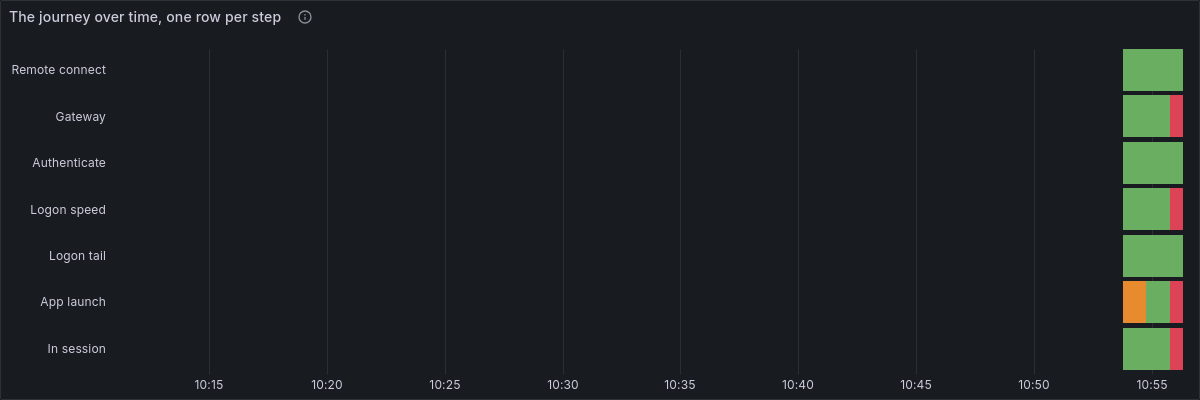
The rows are in journey order rather than alphabetical, which sounds trivial and is not. A journey read in the wrong order is not a journey, and you lose the ability to see a problem travelling along it.
One logon, in full
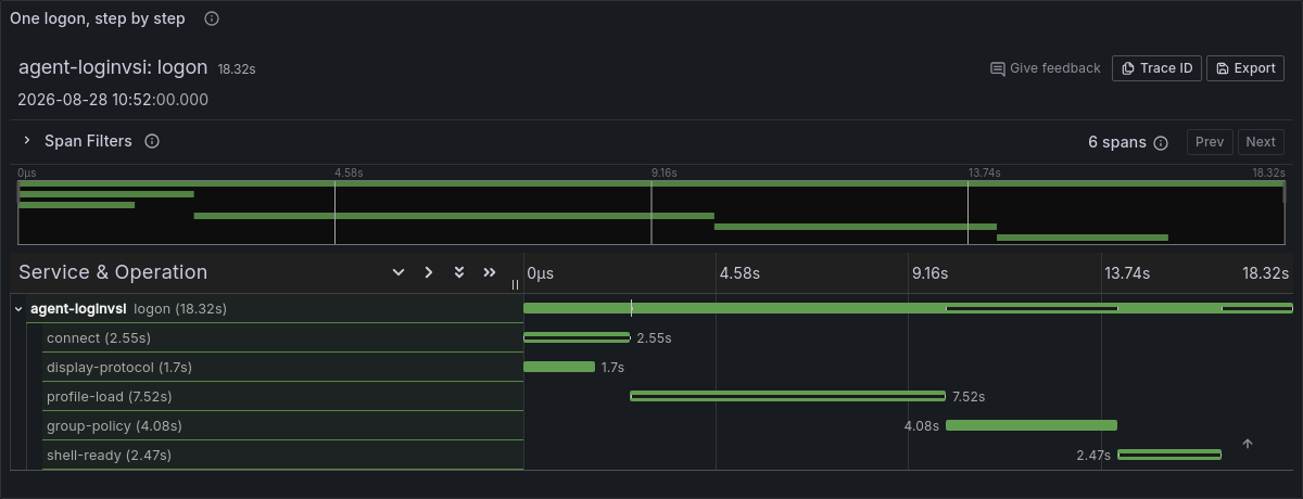
This is the view with no precedent in end user computing. Application teams have looked at traces like this for a decade. Nobody points one at a desktop logon, and there is no reason not to.
Connect and display protocol are drawn as overlapping siblings because that is what they are: the display channel comes up while the connection is still being made. An implementation that presents the phases as a tidy queue is misrepresenting them.
Objectives that burn
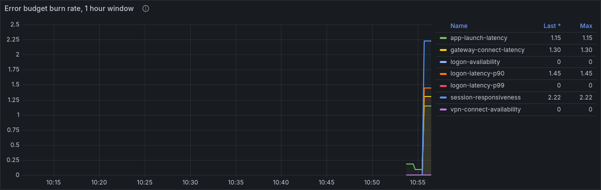
The register compiles to Prometheus recording and alerting rules, fed by live data, so an error budget genuinely moves and a burn alert genuinely fires. Spreadsheet to a number on a screen, with no manual step anywhere in the chain.
Where the time goes
What it demonstrates
One correlated view. A synthetic probe, a real-user experience agent and the platform management API underneath, joined on device name and user ID because that is the only join key available in most estates. When one host is squeezed, all three agree about it without any of them talking to each other.
Synthetic and real users kept apart. Four probe machines and an actual population are different measurements of different things. An experience number that quietly averages them is not honest, so the split is an attribute on every metric.
One pipeline, two destinations. The same collector writing to a local reporting store and to a second backend standing in for an enterprise platform. Where the data lands is an exporter list, not an architecture decision worth arguing about for a quarter.
What is honest about it
The vendor APIs are mocked from published documentation and have not been verified against a live appliance. Two of the ten steps are served from a placeholder source and would need repointing at the real tools. A further two objectives in the register have no agreed threshold yet, so nothing is emitted for them at all, and they are labelled as such rather than left to look healthy.
Above all: every target in it is illustrative. Nothing here has been measured against a real estate, because a target set before a baseline is a guess wearing a suit.
That list is on the page deliberately. An observability demonstration that cannot say what it does not know is a sales tool, and you should not trust one.
Seeing it live
The environment runs on demand rather than permanently. A demonstration is normally a screen share, because it lets us stop wherever you want to interrogate it. Where it is useful for you to explore it yourself, access is issued to named people for a scheduled window.